When it comes to website design, simplicity is key. A crowded site with too many elements can be distracting and confusing for users. However, a clean, professional and well-structured design can still be visually appealing while allowing for easier ways to navigate and provide a better browsing experience.

With the average website user taking just 15 seconds to decide whether or not to continue reading a page, it's vital to create a good first impression. With this in mind, here are our top 7 tips to simplify your design and create a user-friendly site that works for your firm…
1. Focus on Call to Actions (CTAs)
CTAs usually take the form of a button, image or link on the website that tells the visitor what to do next. This might be to call you, request a free quote or subscribe to the firm's newsletter.
CTAs support the sales process by helping to convert visitors into potential clients. To do this effectively they need to stand out from the rest of the page. Choosing a bold, contrasting colour for all CTAs can help you to achieve this.
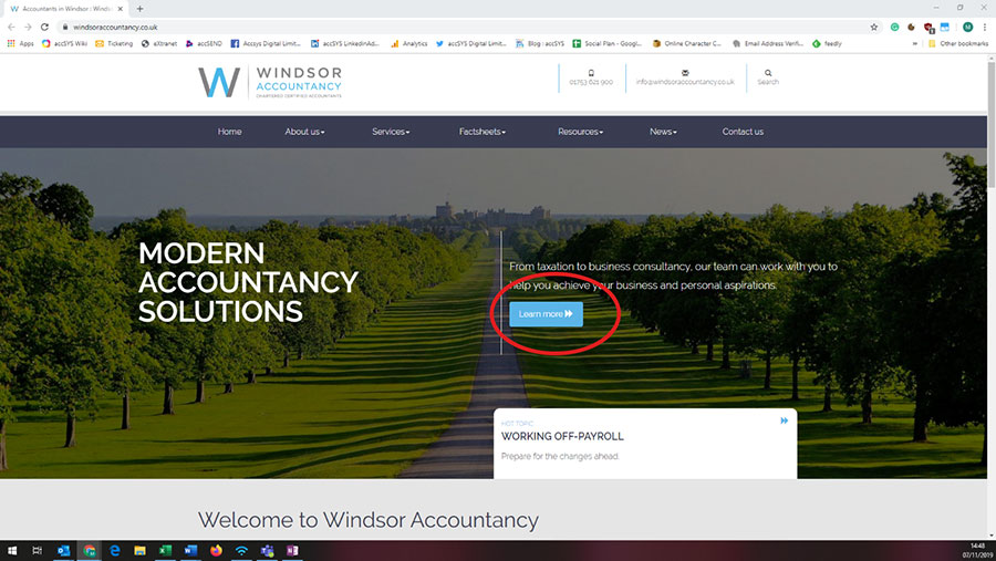
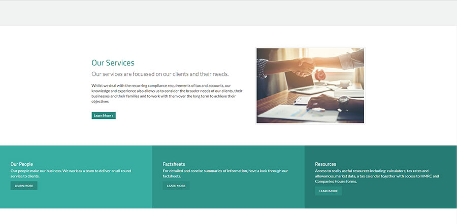
Furthermore, using the same colour for all action requests will train visitors to recognise and associate the colour with doing something. A good example of this can be seen on Windsor Accountancy website, where we used bright blue buttons to highlight the site's CTAs. This site also uses animated blocks for other CTAs, for example the links to the services sections, to help capture the user's attention.

It's important to think about the wording of your CTAs, as this can have a big impact on their conversion rate. The most effective CTAs tend to be action-orientated and convey a sense of urgency e.g. “Request your free tax guide today”.
And finally, don't be afraid of white space! Maximising the space around your CTAs helps to create a clean, simple look and draw readers' attention to the action you want them to complete.
2. Streamline your pages/files
As an accountancy firm, you have a wealth of information and expertise to share with clients and prospects. This means it can be tempting to overload your site with pages of content. However, it's always best to focus on providing website visitors with quality content over quantity.
If you're looking to simplify your website design and create a better user experience, start by reducing the number of pages on the site. Avoid keeping unnecessary pages that don't really add much value, or as a very minimum, amalgamate related pages where possible. There will be fewer places for people to explore and click around, making it easier for them to find the information they need. A reduced page count will also result in a simpler navigation menu.
3. Keep to a user-friendly 'standard' main navigation
The navigation menu is the backbone of your website's structure and helps visitors find the information they're looking for. If your site navigation is too complex, you risk overwhelming and confusing visitors. In this case, users may simply give up and abandon their visit.
Plus, a site with too many sub-navigation levels doesn't perform as well on mobile devices, with users often having to spend a long time scrolling down to find the right category. This isn't ideal, especially considering that most sites are now viewed on a smartphone.
To ensure your site is simple and user-friendly, it's best to use a standard main navigation menu. The key is to make it as easy as possible for visitors to access the information they need. We suggest reserving the top navigation menu for the most essential options and then creating clear drop-down subcategories. It also helps to use familiar words so clients can recognise and understand the categories quickly.
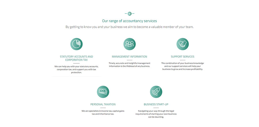
For example, many of our accWEBSITE customers' sites have a 'Services' tab in the main top-level navigation, which then breaks down into individual categories / pages. This approach works well because each section is clearly defined and the wording is simple, so it's easy for visitors to find the relevant service in as few clicks as possible.
4. Stick to your brand/colour palette
It's usually best to avoid using too many colours on your website, as this can be distracting for visitors. Instead, why not select one or two colours from your logo? Not only will this keep the colour scheme clean and simple, it will reinforce the firm's branding throughout the site.
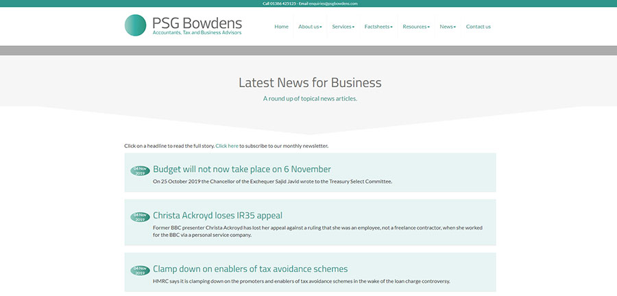
When designing PSG Bowdens, we used a simple colour palette based on their logo to create a clean and consistent look.


If you do feel the need to add more colour, consider using shades of the same colour, or maybe an accent colour, to introduce subtle variation where necessary.
5. Only use elements that serve a purpose
Many websites contain decorative elements and design features that don't really serve a purpose. But a busy site with too many unnecessary elements can distract visitors and divert their focus away from the key message.
Before adding an element to your site, always ask yourself: What purpose does it serve? And does it help to communicate your overall message?
Again, simplicity is key. Identifying and removing at least some of the unnecessary elements on your site will create a cleaner and more polished look, while focusing users' attention on what matters most.
A simpler site is also more scannable, and with the majority of people skimming content for key phrases rather than actually reading it, that's a big plus!
6. Avoid using popups or elements that appear without user interaction
Popups that appear suddenly without instruction can be irritating and disruptive to a user's browsing experience. Plus, because they're typically used for adverts, most people will automatically close them without reading the content. It's for this reason that we advise clients to avoid popups or, at the very least, use them sparingly.
The same goes for elements such as auto-play videos and background music. Unexpected sound can be off-putting and risks annoying users, particularly if they're in a setting where noise isn't appropriate e.g. in the quiet carriage on the train.
If you do want to incorporate videos into your site, it's always best to put the user in control (add play and pause buttons, for example).
7. Don't make your logo too big!
As the online face of your accountancy firm, it's natural to want your logo to take pride of place on the website. However, while your logo is a key element in the design, it shouldn't overpower the site. A logo that's too big will dominate the top half of the page and appear to 'shout' at your clients. It will also push key messaging further down, meaning visitors are less likely to see the information they need.
Although it's important that your logo maintains a professional look, more emphasis should be placed on the quality and positioning of your content rather than the size of your logo. Remember, most people that visit your website are looking for a solution to a particular issue e.g. help with their tax return or advice on retirement planning, and your content should be presented in a way that answers their query as quickly as possible.
And let's not forget, the logo is only one element of your brand's identity. Your brand is communicated in a variety of ways, for example, through the company name, its ethos and values, tone of voice and position in the marketplace.
How accWEBSITE can help
Mastering the perfect website design can be tricky. That's why thousands of accountants have come to us to design, build and host their website.
Our experienced web designers can create an attractive design that conveys your firm's messaging and brand identity, while still providing a great browsing experience for clients and prospects.
We understand that building and maintaining a website isn't always an accountant's top priority, so why not leave the hard work to the experts? To find out more about our accWEBSITE offering, click here.